Saturday, December 1, 2012

Santi-One Bedroom and Common Space Design.

The final presentation for the semester has been a great experience. As required to follow up on the semester’s lessons and project we were instructed to produce a final presentation that would develop the kitchen and bathroom into a one bedroom apartment and common space. The goal was to create a presentation that could be potentially presented to our client. The client’s needs were established in the beginning of the semester and were always a key component to the design that we wanted to translate into our designs. Along with the clients need we would evolve our concept of what and abstractions to integrate into our designs.

For this project I approached as a realistic opportunity, my goal and objective was to create a presentation that would translate over well to the clients needs. The process work that lead to my final project was very crucial to my over all design, as I analyzed my concept I recognized the possibilities of creating a very interesting modular shelf idea that I had started in the Kitchen and Bathroom project of the beginning of the semester. I wanted to incorporate the modular shelf idea throughout the whole space and have it lead into the common area, not to only provide extensive storage space but to create a sense of unity. In the common area I took the shelving aspect as an opportunity to create an artistic and decorative feature; it would house the lighting out of sight and give the space a real sense of direction. I also used columns to create a directional guidance for people who would solely use the common area as a passage space to the Spa or third floor.

Along with the positives there were also many things that I learned along the way so that I would adjust for my next projects. In presenting my concept and design I relised that the idea of sustainability is more that a lament term that goes along with a green tag. Doing a little more research is necessary when trying to understand the aspect of your own design, that will stick with me forever. I have never felt so unprepared to openly discuss green ideas. I know that for the next project I will be ready. Overall the one bedroom design fit well into what I felt the clien asked for. This was a great experience to prepare me for real life situations, the loose drawing and rendering styles were very effective and a positive touch to help narrate the design.
 
Take the opportunity to look over the posters I created and offer some feedback or comments about what you may want clarification on. Thanks for reading.


Wednesday, November 28, 2012

Meeting with a professional

As part of the residential development for the site we are currently working on, we were required to meet with a professional designer who would help us further develop out designs, and give us feedback to the work we have created. To the meeting we were required to take a drafted set of plans, materials, and over visual aides that would help guide them in understanding our designs. I had with me some very crucial elements that I felt would give some reassurance to what I was trying to do, and when I met with the three designers from WSU I felt it was a great success.

I met with Joanie Thomas, Jennifer Reynolds, and Stacy Gravel who are all employed here at WSU with the Architectural and Engineering Services department. I got some very good feedback that would follow through into my design solutions. One of the most important topics they brought up were the idea of really emphasizing the modular shelving and using materials that would reinforce my concept. I was originally thinking of using some sort of plastic or resin based material for my shelves, but they thought that by creating as much visual texture it would help push my fingerprint concept a little further, along with the whole natural material feel that I was pursuing. Overall I was really happy with the result and know that their creative input really helped give me a better approach overall, and led to a great product and result.

Saturday, October 20, 2012

Bathroom Design

Working again on the "Santi" residence I have come across a new challenge, this time I was developing my concept that tied together the idea of unique individual definition of what a home is to a bathroom design. Along with the concept and mentallity of functionallity and aesthetics I was taking into consideration the accessibilty aspects, this was a challenge when deciding were I was to place my toilet, sink, and the design of the shower. I knew that I wanted to have a open floor plan that would allow easy turning peraminters for people who may be wheel chair users without compromising the look and feel of the project, the materials were all chosen to reflect my thought and concept that related back to the clients need as well as my conept of creating ones own definition of what home may be defined as.

After a process of creating smaller floor plans, I decided on a side mount accessible taoilet with that advantage of a roll in shower and fully accessible sink. I made sure that there were side bars on the side of the toilet that followed ADA recommendations as well as sink and countertop heights and storage space. This was a really eye opening expereince to recognize how much things can change with just a matter of inches.

Overall the completion of this project was in my opionion was successful, but could use a lot of improvement. I would have to say that more time could be used to add sketches and possible perspectives, and the overall poster layout could use some improving but I would say that I am happy with the result.

Tuesday, October 9, 2012

Seattle, Showrooms and Habitat for Humanity

While in Seattle I was fortunate enough to find some real important locations that I had never really heard of or knew even existed. I have live in the Seattle area my whole life and have driven past many of the showrooms we go a chance to visit.

The first stop was at the Seattle Design Center, located on fourth Ave. I never knew what was behind such a simple facade, I was taken back by the showrooms that were located within this center. I am excited to travel back and take some more time to peak around, I know that this will be a key location for my future, after that we were escorted around near the area to tile and marble showrooms and warehouses. The amount of information that given was almost like an overload, but so helpful. I was very impressed by 3form, the place was amazing! We got a chance to learn so much about lighting options and the possibilities of resin, as well as how the process of these fixtures can help in the innovation of our own designs.

Another great site that were able to visit was at the Seattle Center Pavilion, there we had a chance to visit a new project that Habitat for Humanity is getting ready to launch and mass produce. It is called "House of the Immediate Future", a very remarkable step forward for low income housing and a great focus on sustainability. The key feature that I would have to say I was not too thrilled about was the double fill walls that wrapped the exterior. Just as it sound they have placed two full structured framed walls to keep better insulated the whole house. I am sure that the amount of conserved energy will be great, but feel as though there really could be a better solution to the problem with a less invasive building process.

Overall the project and visit to all the showrooms were a great experience, and I am so thankful for the time and expertise by all the people who showed us around and gave us insight to the world of design.

Monday, October 8, 2012

Seattle Urban Sketch Crawl


This was the first sketch that I completed at the Seattle Sculpture park In Seattle. There was a great turn out from the Seattle Urban Sketcher, and was a lot of fun working around them and seeing how they approached the park.

My second sketch below was a quick 10 minute sketch that was influenced by my teacher Bob K. he had previously suggested that I try a more free and loose style. I think that I was able to accept that it was very sloppy after the fact that I recognized that the features in the environment were still coming through on paper.

Kitchen Project

If there was one major thing that I have learned thoughout this process of developing an idea to a final design solution it would be how important the idea of time is. There is no 25th hour and the time that is allowed is not an impossible feat to work with. I have to say that there were some sucessfull exectutions that I am proud which completed my vision, but at the same time there are many things I would like to go back an fix.

One of the most successful features would be the elevations and section in my drafting, I dont know why I colored them in, matybe to offset the fact that my perspectives seemed to be so poor or to really give an additional vibe of completion.

There are way to many things I would go back and fix but know that no matter what I would never be fully satisfied with a "finished" project.

With that being said, I feel that my board could use a lot of improving, as well as my perspectives, and the overall layout that was the result of my rushing.

Some detailed information:
-The shelving that wraps around the dining and kitchen area, would be modular, allowing for more or less storage space. Gloss blue finish.
- The counter top is white.
- The Cabinets below are of a dark Birch Wood.
- All appliances are Maytag EnergyStart, in a white finish.

Job Shadow

During a visit to Seattle I was able to go and shadow one of the leading design firms here in the state of Washington. Callison Design Firm, on 5th Ave. I would have to say that the experience was one of the best in my life. I really got to got a feel for the style of company that I would one day like to work for, everything from the design aspect to the enviornment really gave me an eye open experience.

My partner, Stephanie Chahan, and I were escorted around the offices that over looked the North, East, and West side of Seattle by a Junior Designer, Beta, who had recently graduated from the Interior Design program at Washington State University. She introduced us to many important people that all take part of the design process for many of the projects that the company works on. I learned that there is more to design that aesthetics, budget, and willingness to work, It has a lot to do with the connection that you are making to the built environment, the people who use the space, and how you are making an impact for the future. We had a chance to ask many questions and soak in all the information that they had for us.

They had very useful tips and information for a student like myself, and gave me the extra push I feel I needed to ensure my success in the field. Since the visit I would say that I have been more focused on becoming a better designer and student, so that I one day could go back an apply with confidence.

Some of the steps that they allowed us to observe gave me some insight into the type of work that I should be applying as a student. They not only were very helpful in that aspect but they were very informative in the importance of hand sketching as well as reassuring the idea of becoming knowledgeable in all drafting programs and focusing on portfolio, which I just started to work on.

Accessibility Sketch Journal


Exiting Carpenter Hall.
Working on the idea of accessibility in our built environment has been an eye opening experience. I have had some understanding of people with sensory disability in the past when I took courses on American Sign Language and would go to the meet ups and gatherings, where Deaf, Hard of Hearing, and even Blind people would come together to hangout. I tried to keep up and felt like I could never really understand and grasp the full understanding of their situation in the environment that they lived in. I just felt like I was an outsider looking in, which resonated again with the project that I participated in.

Daggy Faculty Break Room
In a group of two we were given regular everyday tasks of going from one location to another, but this time in a wheelchair. I started off by using the elevator and heading to the bathroom on the second floor, this is when I first met a student that is a wheelchair user. I asked him if he had any tips and he mentioned that the wheel chair we were assigned with actually was meant to be pushed rather than to personally operate. I knew from there it wouldn't be easy. As I entered the bathroom I recognized the inability to fully operate both door and wheel chair, I had a real tough time maneuvering within the space and getting in and out of such a space.

The next task was to head to another building relatively close requiring exiting and wheeling myself through a more uneven and rough surface. I didn't expect the change in terrain to be so drastic but it really shook me up to see the difficulty I was having. The doors were heavy and narrow, the carpets where like quick sand, and the halls were hard to maneuver around.

I really can't imaging the difficulty some may have when going to new places, having to re evaluate every move, and hoping that the accessibility will make it possible for them to live theirs lives. As a design student I truly hope to subconsciously make smart and informative decisions. The cost and innovations of these design solutions should not be a second hand thought, as a human race we should think with understanding an acceptance that not everyone is "average" and that there is more to the design world than what may be visually pleasing to some, but rather to make all things pleasing to all. If we allow ourself to limit the accessibility to some rather than others we will only continue to drive a divide between ourselves and limit our possibilities as a human race.


Sunday, October 7, 2012

Concept Development

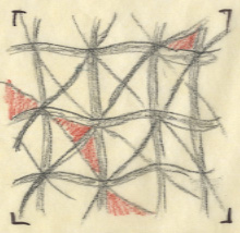
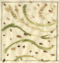
In developing an idea (design solution) I have found that a set of process work helps best when building off a foundation. As part of this process I was first given the task of working off the base of some lyrics, poems, quotations, etc. in relation to the ideas or reference of "home". I choice a song titled "Coming Home" by Diddy -Dirty Money where I broke the song down to my personal reflection of its meaning, and what the meaning or definition of a home and house may be or mean. To some its one thing and to others it's another. This idea guided me to develop some parti's that represented that sole foundation. I examined the idea of the materials in a home, what it takes to create a home, how do we define home, and so on. I found many literal ways to express those thoughts, one in particular was wood, and a closeup abstraction of woodgrain, along with the systematic process in which a home or a house is created.

I saw something very interesting within that idea an decided to develop it further, I continued on until I reached the point of recognizing the relation of wood grain to a finger print, or the similarities in the form of the two. The ways that they both seem to have a wrapping or layering effect of unique individuality, the natural form that the two have, and as well as the possibilities of abstraction.

These abstract parti's would ultimately help me through my conceptual models and the foundation to the design solution for the design problem. I was (and for the most part, still am) working towards a solution for a kitchen and living space in a two bedroom apartment located in the Palouse. This process of conceptualizing and developing has been very helpful, and I find to be very productive solution in the overall design process. I would say, that had I more time, I could keep working on developing a more efficient and greater solution, but with that being said, there are always going to be constraints and timelines that one must follow and accept. Moving forward requires confidence and acceptance that continuing with the design will only allow for it to grow and there for getting better.


NOTE: Specific location, and the clients name, I am under the assumption that he would like to keep it disclosed and private.


Client Brief.

As a designer one of the most important tools to developing a good design is taking into consideration the needs and wants of a client. This sounds like a no brainer but there is more to that notion than one may think.

Recently working on a project for a man who has bought a new property in the Palouse, he was looking for some creative solutions for a one and two bedroom apartment (among a common space, and retail and spa amenities). He had given us the task of developing possible kitchen and living space designs, while keeping in mind the location, history, and budget. At first my mind raced with ideas and visions, but noted that the best possible outcome would be by developing a connection to his wants and needs; this would in turn help guide me in the right direction.

As the group consulted and gathered questions we came up with a organized list of important aspects and features that would revolve around the design solutions. We came needed to figure out the Client's Philosophy, the Deign Problems, and the Design Goals. These key factors would be the compass to help each and everyone of our design process along with supporting materials and expectations.

I was able to gather and collect important information that would help spark my design solutions, while at the same time allow me the freedom (in a way) to stay within my own design philosophy. I believe that this process of creating a client brief was very crucial in  creating a  successful base to the overall goal.

NOTE: Sketch will be posted soon, and as far a specific location, clients name, and the actual client brief, I am under the assumption that he would like to keep it disclosed and private.  

Saturday, October 6, 2012

Kitchen Design thoughts

Recently worked on a project, not 100 percent satisfied with the results, but I know I tried my best to fulfill the requirements to the best of my abilities with the timeline. If there was one thing that I could do to improve, it would have been my time management. The project as a whole could be 10 times better and still not complete. Even then I would want more time, but that helped me realize one major thing, control and develop, no project will be fully complete but that shouldn't ever limit the quality of the finished project. Timelines are for a reason and should be taken seriously. I know that I need to go back (and will) and work on a few things just to personally satisfy the completion of what've got. For the next project I think I'll take my time more serious.

Pics up soon.

Wednesday, September 5, 2012

Adaptive Re-use

The assignment on hand was to look at case studies that architects, designers, and other professionals have done to get the sense of the mind set that we should have when working with clients goals needs and expectations. There was so much to look into that the overwhelming task of research alone was enough to make me focus on the simple idea of just one presented element. Adaptive re-use, specifically of late 19th century buildings and the contemporary solutions for the client. In researching the John Knox church I was able to look at the historical context and importance to the surrounding location as many had seen it for generations as a focal point of their town. This is a great example of the re-use of a building that proves not does one building stay alive for its original intended purpose but can support and revive as a new exciting solution for today's lifestyles. Take the time to look at my own work, thanks.

Friday, July 13, 2012

Sketch Journal, #2.

Sketch 4, Fruit Color Value Study. Painting, that word alone is a huge intimidation factor as an artist, not because I don't feel confident or comfortable with the media, but because of the amount of great artist that have inspired the work I strive to achieve. Artist and painters like Frida Kahlo, Paul Gauguin, Pablo Picaso, and many others whose work is and has been so revolutionary.

Even though I have put such great emphasis on such a simple minuscule piece of work, it is the root to all good design. Understanding this concept of color, shade, shadow, and presentation has the potential to turn good into great. I was able to successfully create a piece I was happy with and understand the use of color with the contrast of hues tints and shades to distinguish the possibilities of the colors I had to my disposal.


Sketch Journal!

Sketch 3, shades and shadow. The recent lecture and readings that supplemented the assignment provided me with a new view and sense of vocabulary for the use of common sketch and drawing techniques. I enjoyed the challenge and perspective of drawing stairs alone, and to add the shade and shadow with the appropriate degree of contrast was very helpful in understanding the contrast that is made visible on a regular basis all around us.

As a designer and artist I see this a great tool to use when approaching new ideas or concepts that may require that extra emphasis. Shades and shadows really can help create something new and more visually interesting if done properly and with the right materials. I see the importance that this sketch has, and the purpose in clarification as to marking the parallel lines as well as the perpendicular lines to the shades and shadows (even though my drawing did not show much to that effect).


Digital Sketch

Assignment two, digital sketch of the Palouse. As far as the Adobe suites go Illustrator is a new tool that I have never used before, but have to say that it is a awesome resource to learn. The possibilities with this are definitely endless. It was a new experience to work with the forms of layers and image altering tools available. I had a great time trying to figure out how things worked as well with the use of the WACO tablets that I have never used before. The pen stylus that accompanied the tablet was a whole new experience, but I quickly adapted... I feel as though I was more capable of playing around with the image as I used to on the standard Windows Paint application that was on every computer I had ever owned before I got my Mac. I was able to alter the look of a old beat up truck and make it look more cartoon like with some fun and interesting modifications (the machine guns sticking out the windows) and the flame look on the hood. Overall the introduction to the tablets and Illustrator was a lot of fun and a tool I'll have to regularly practice.

Elements and Principles of Design


Assignment 1, Elements and Principles of design posters were a great foundational tool for the vocabulary and work load for this ID 103 summer class. The required definitions and use of vocabulary incorporated that was required to follow along side our images gave a new meaning to the words we use on a regular basis, yet we may take for granted or not fully understand.

I was surprised by the depth of meaning that some of these words took, and the challenge that came with trying to find imaged that correlated to the use of those words. The era in time that I was assigned was during the 1920's through the mid 1940's, The Art Deco movement. I had a lot to work with and overloaded with information and pictures, yet my personal challenge was to create a more personal meaning to the words and set images; I wanted to expand my knowledge of the era and also challenge the ideas that may have been clear to others. Overall I feel as I did the best I could, and created a successful bond between word, image, and definition.

Another challenge that came with this assignment was the use of the Adobe software and online network file sharing system. I have played around with Photoshop and Indesign in my personal time but never with requirements and expectations, but quickly realized the potential that they had to make my work really stand out, and define the purpose of my overall scheme. I enjoyed the challenge as well as the new tools that came with it. I now feel though as from here on out my standards for design, presentation, and overall work is at a new level and will only benefit as long as I work harder to improve my skills.


jOSE cAMACHO

Tuesday, July 3, 2012

Project A, Frida Kahlo.


Project A, Artist poster. A true inspiration of mine, Frida Kahlo. As an artist she was great, as a role model she was an inspiration, and as a human she was real. I feel that her story of love, pain, and art is something that anyone can relate to no matter how much you like or dislike her work. She was a real person with her shares of ups and downs and wasn't going to go down without being heard. Kahlo's suffering, passion, and pain was seen throughout her work as exemplified  in the images that I included in my poster. She lived a short life, but the impact that she left behind was one that will catch hold and has been a motivational tool for me.

The use of Indesign and Photoshop was very helpful in creating a personal informative poster, along with the Williams NDDT readings that helped outline and guide me in the design process of placement and understanding of common well structured elements of text layout and design. I feel though as my poster could use a bit of improvement, but generally it has the elements that I was trying to achieve in the whole scheme of things. I have been inspired to continue to focus on the use of text and layout to better improve my presentation skills as I know that I am not a great speaker, and could use all the help possible by visual supplements.